SharePoint Framework カスタムプロパティに繰り返し項目を作成する
今回は、Web パーツのカスタムプロパティに繰り返し可能な入力項目を作成する方法についてご紹介します。
流用いただくことで利用者によって任意の数設定できるタブ付きのリスト Web パーツやタブ付きのテキスト Web パーツ、独自レイアウトのリンク集など様々な Web パーツ開発アイデアに活かしていただけるかと思います♪
完成イメージの確認
今回作成する Web パーツの完成イメージです。
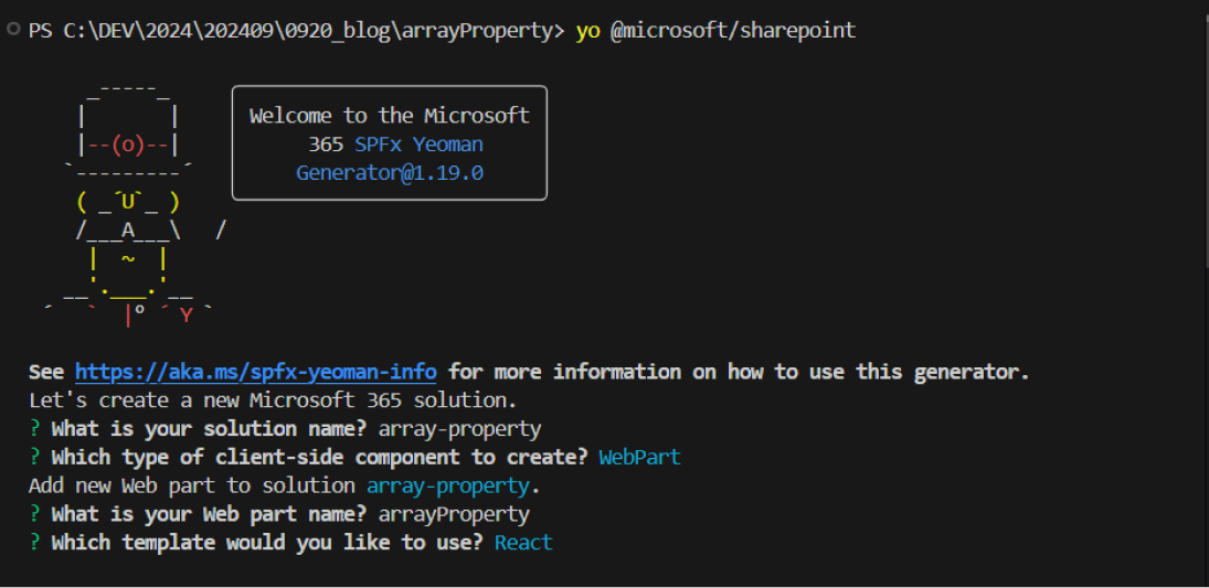
ソリューションの作成
フォルダーを作成し、Web パーツソリューションを作成します。
React を利用する開発が多いと想定し、React ライブラリを利用したサンプルで作成していきます。
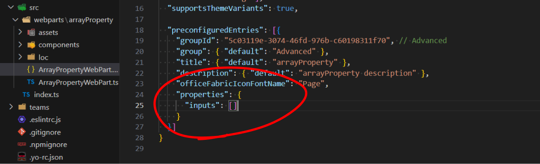
1.各種設定
ArrayPropertyWebPart.manifest.json を開きプロパティの初期値を設定します。
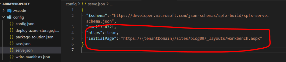
serve.json ファイルを開き、テスト用のサイト URL を設定します。
3.メインクラスの修正
ArrayPropertyWebPart.ts を開きソースを以下の通り修正します。
import * as React from 'react';
import * as ReactDom from 'react-dom';
import { Version ,Guid} from '@microsoft/sp-core-library';
import {
  type IPropertyPaneConfiguration,
  PropertyPaneTextField,
  PropertyPaneButton,
  PropertyPaneButtonType
} from '@microsoft/sp-property-pane';
import { BaseClientSideWebPart} from '@microsoft/sp-webpart-base';
import ArrayProperty from './components/ArrayProperty';
import { IArrayPropertyProps } from './components/IArrayPropertyProps';
export interface IArrayPropertyWebPartProps {
  inputs: { id: string; input: string; }[];
}

export default class ArrayPropertyWebPart extends BaseClientSideWebPart<iarraypropertywebpartprops> {

  public render(): void {
    const element: React.ReactElement = React.createElement(
      ArrayProperty, {inputs: this.properties.inputs,}
    );
    ReactDom.render(element, this.domElement);
  }

  protected onDispose(): void {
    ReactDom.unmountComponentAtNode(this.domElement);
  }

  protected get dataVersion(): Version {
    return Version.parse('1.0');
  }


  private addInput(): void {
    const newInput = {
      id: Guid.newGuid().toString(),
      input: 'New Input'
    };
    const newInputs = [...this.properties.inputs, newInput];
    this.onChange(newInputs);
  }


  private removeInput(index: number): void {
    const newInputs = [...this.properties.inputs];
    newInputs.splice(index, 1);
    this.onChange(newInputs);
  }

  private onChange(inputs: { id: string; input: string;  }[]): void {
    this.properties.inputs = inputs;
    this.render();
  }


  protected getPropertyPaneConfiguration(): IPropertyPaneConfiguration {
    const fields = this.properties.inputs.map((input, index) => [
      PropertyPaneTextField(input.id , {
        label: `Input Text ${index + 1}`,
        value: this.properties.inputs[index].input,
        onGetErrorMessage: (value: string) => {
          this.properties.inputs[index].input = value;
          this.render();
          return '';
        }
      }),
      PropertyPaneButton(`removeTab${input.id}`, {
        text: "Remove Input",
        buttonType: PropertyPaneButtonType.Normal,
        onClick: this.removeInput.bind(this, index)
      })
    ]).reduce((acc, val) => acc.concat(val), []);


    return {
      pages: [
        {
          header: { description: "Array Input" },
          groups: [
            {
              groupName: "入力項目",
              groupFields: [
                ...fields,
                PropertyPaneButton("addInput", {
                  text: "Add Input",
                  buttonType: PropertyPaneButtonType.Primary,
                  onClick: this.addInput.bind(this)
                })
              ]
            }
          ]
        }
      ]
    };
  }
}
4.プロパティインターフェースの修正
IArrayPropertyProps.ts を開きソースを以下の通り修正します。
export interface IArrayPropertyProps {
  inputs: { id: string; input:string}[];
}
5.React コンポーネントの修正
ArrayProperty.tsx を開きソースを以下の通り修正します。
import * as React from 'react';
import styles from './ArrayProperty.module.scss';
import type { IArrayPropertyProps } from './IArrayPropertyProps';

const ArrayProperty: React.FC<IArrayPropertyProps> = (props) => {
  const inputList = (): JSX.Element[] => {
    return props.inputs.map((list) => <li key={list.id} >{list.id + '/' + list.input}</li>);
    }
    return (
      <section className={`${styles.arrayProperty}}`}>
        <ul>{inputList()}
       </ul>
      </section>
    );
  }
export default ArrayProperty;
動作確認
ターミナルから以下コマンドを実行します。
gulp serveターミナル上に reload が 2 回表示されコンパイルが完了したらテストを実行しましょう。
Add Input ボタンを押すたびに入力項目が追加され、Remeve Input ボタンを押すことで項目が削除されます。入力項目の値を変更すると Web パーツ内の文字列も即座に変更されるようになりました♪
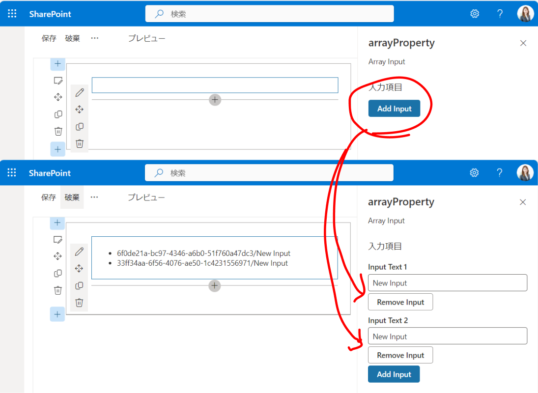
今回のつくりでは、カスタムプロパティから登録した値を li タグにいれて表示させています。
まとめ
カスタムプロパティって利用者から Web パーツに設定値を受渡しするための重要な設計となるので、固定数ではなく配列にしてより柔軟な Web パーツを検討するアイデアになれば素敵かなと思い考えてみました。
実装のポイントはテキスト入力項目の ID を GUID にして管理しているところで、基本的には普通の配列操作となります。テキスト入力のヘルパー関数である PropertyPaneTextField と PropertyPaneButton がオブジェクト配列で管理できるところは面白いですね♪
高度なカスタマイズ 関連コース
-
CI620-H SharePoint Framework 開発 基礎
SharePoint Framework (SPFx) を利用すると独自の Web パーツ開発や、ヘッダー・フッターのカスタマイズなど、さまざまな独自機能を開発し、追加することが可能です。これから SharePoint Framework の開発を行う方を対象に知っておくべき内容を 2 日間に集約して体系的に解説!
-
CI721-H Power Apps & Power Automate 実践ラボ - 業務管理編
「業務管理」をテーマに、実務でよくある課題を毎回ピックアップ。設計のポイントや設定手順、つまずきやすいポイントへの対処法、実践的なテクニックや Tips などを確認しながら、実際にアプリやフローを一緒に作成していく、上級者向けの実践型コースです。
-
CI722-H Power Apps & Power Automate 実践ラボ - 承認プロセス設計編
「承認プロセス設計」をテーマに、実務でよくある課題を毎回ピックアップ。設計のポイントや設定手順、つまずきやすいポイントへの対処法、実践的なテクニックや Tipsなどを確認しながら、実際にアプリやフローを一緒に作成していく、上級者向けの実践型コースです。